Is My Cover Good Enough?
If you are using the Cover Creator tool in KDP to make your cover, consider how many thousands of other people are using the same exact design. Your cover is your MAIN ADVERTISEMENT. Why would you want it to be a duplicate of thousands of others out there?
Also, many of those default templates break the rule of thirds of good cover design. What is the rule of thirds? Here are some links:
https://www.coverdesignstudio.com/layout-rule-of-thirds-diagonal-scan-and-more/
https://www.coverdesignstudio.com/book-covers-layout/
https://www.canva.com/learn/visual-design-composition/
Take your cover rectangle (1800 x 2700 type ratio) and divide it into three equal sections on both the horizontal and vertical. The eyes are drawn to the first horizontal line since we tend to scan from top to bottom. Anything in the top two horizontal sections gets more eye time than the lower third. This is where you typically have your book title along the top third and the main thrust of your image starting to show up in the middle third and extending to the bottom third where you’ll also have the author name.
That gawd awful template with the ugly stripe that runs across the bottom middle is an abomination to good cover design. Stop using it.
No professional cover uses solid color and pastes an image in the lower part of the book. Why? Because our eyes are split between wanting to read the text at the top and look at the pretty image at the bottom. The result is a subconscious declaration of ‘ugly’. Professional designers use an image on the entire page and put the typography over the top of the image. That way, you blend the text with the artwork and the eyes can appreciate both at the same time.
Ideally, you want the left and right side of the cover to feel balanced in the use of ‘paint’.
The other thing to look at is negative space. How much space is between the edge of the book and the text? It should be equal. In other words, make a measurement of the amount of ‘blank’ space between the top edge of the book and the top edge of the first line of text. Call it X. You should have X amount of space between the book’s edges and the first instance of text anywhere on the page. Also, you should have X amount of spacing between say, the book name and subtitle. That will help it look balanced. You never want the text to run up to the edge of the book. Not only does that feel crowded and DIY, but if you decide to use that on a paperback, the trim will lop off part.
You can also have asymmetry in the cover design, but treat the left and right like a seesaw–you want it to feel balanced in total amount of ‘paint’ appearing on both sides.
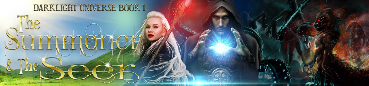
It’s ok to make your own covers. But you should understand how to make good looking covers that can compete with other books in your genre. Take a look at what Paul Cave did with his self-made covers. (Using him for an example since he posted recently in another thread on this forum). Using stock photos from Shutterstock, and appropriate fonts for the genre, he created gorgeous covers that look close to professionally done.
That brings me to appropriate fonts. Some fonts convey romance, others thriller. If you are mixing the wrong fonts together, people will be confused when they look at your cover. You want your cover ADVERTISEMENT to say what your genre is in title, font, and cover image. This web post has organized the fonts into genre:
300 Foolproof Fonts by Creativindie.com
You can find these or equivalents available for free on sites like fontsquirrel (https://www.fontsquirrel.com/). Just look for licenses that let you use the font for jpg images you can display on computer screens or print.
Finally, get yourself access to or buy a graphics program that handles layers. That way you can have a background image and add typography on top without having to continually undo if it melds into the background and you didn’t like it. (In other words, MS Paint is NOT a good tool for cover design).
Canva is a good online tool to create covers, though I found the templates it had rather limiting. You are better off learning how to take a stock photo (or three) and create a good looking cover from scratch. That knowledge can also help when you decide to make a paperback and need to create a spine and back cover and want something nicer than what KDP or CS can make.
Remember – your cover is your ADVERTISEMENT. People will judge your book by the cover and give it all of three seconds when scanning for books. Maybe your tag line in your blurb will stop them from moving on if the cover is so-so, but don’t count on it.
Is My Blurb Good Enough?
If your cover is awesome but your blurb stinks, you can lose sales.
How to write good blurbs:
Why should I use a tag line?
If you do any Amazon advertising, you’ll need a 150 letter catchy sentence that encapsulates the essence of why someone should buy your book. So it doesn’t kill you to think about writing this when coming up with your blurb. Also, people have to click the Read more link to see anything beyond the first line or two. So you are trying to engage the reader’s interest so they click that to read the rest.
FICTION
You want your blurb to convey genre and sell the person on buying your book. It should also tell the potential reader what type of story it is. Romance? Hero’s Journey? You don’t need to explicitly state what it is, they should be able to tell from reading your blurb.
The basics of a fiction blurb:
What is a general description of the setting in the initial area of the book?
(you don’t want your blurb to go much past the setup of your story)
For your main char, answer the following questions:
- Who is the main char? (Say something about them)
- What is the char’s BIG goal?
- What blocker/antagonist stands in the char’s way?
- What must the char do to overcome the blocker?
- What happens if the char fails?
If this is a romance, then you may need to answer the above char questions again for the other main char, especially if it’s a two person POV book.
Courtney Milan books have good romance blurbs
The general structure of a fiction blurb:
Tag line you put in bold like this: <b.>text to be bolded<./b> (remove the period to get the proper tag symbol)
Paragraph 1 talks about the character before EVENT happened. What their pre-event hopes and dreams are and a basic world description.
Paragraph 2 talks about EVENT and how that changes your character’s direction in life. New goal, new blocker, new stakes.
Paragraph 3 is your epic setup of events to happen. Hopefully, it will wind the reader up and leave them hanging so they want to buy your story.
SELF HELP
You want to establish yourself as an authority. Why should people buy YOUR book vs the other 1000 in the field? You’ve suffered with clinical depression all your life and developed a coping strategy – that establishes a rapport with anyone suffering from depression while giving them the hope that if you found a way to deal with it, so can they.
You should also tell them what they will get out of this book. They will learn how meditation relieves stress, or how making to-do lists or breaking down problems into smaller parts can minimize anxiety.
You should find the top ten best selling books in your genre and write down their blurbs. Analyze what each paragraph in the blurb is accomplishing. Then put that to good use in writing your own. Remember, this is part of your advertising, so don’t ramble on. Keep it tight.
Is My Look Inside Good Enough?
LOOK INSIDE
The 10% sample of your book is the third line of advertising. This is where readers will judge whether your book looks well put together, properly formatted, free of grammar mistakes, and interesting enough to read. I’m not going to cover paperbacks. Buy or download a template for print and save yourself a load of grief.
What books commonly have in the pre-matter (the pages before chapter 1).
Book title page – a text version of your cover with the book title, subtitle, author name, publisher name
Copyright page – you want to establish your rights on your book by having this displayed. You should also credit the cover designer and any other creative work that was used to make the book. Also a disclaimer.
Here’s an example of what I used:
Copyright © 2017 C. Gold
Cover Design by HotCovers.net
Book Layout © 2017 BookDesignTemplates.com
All rights reserved. No part of this publication may be reproduced, distributed or transmitted in any form or by any means, without prior written permission.
Second Edition
The Summoner and the Seer is a work of fiction. Names, characters, places, and incidents are a product of the author’s imagination. Any resemblance to actual people, living or dead, or places, is completely coincidental.
Golden Elm Publishing
Redmond, WA
Please visit the author’s official website:
www.thegoldenelm.org
Dedication – the author wants to dedicate this to blah blah. You can also add quotes and such here.
Foreward – this would be by someone NOT the author who writes about the author or the book or both.
Maps – maps typically go at the beginning
Table of Contents – Here’s where many indie authors make their first huge mistake. They use periods and line numbers and come up with something like:
Chapter 1……………………5
Chapter 2…………………..10
Chapter 3…………………..15
Now on my screen currently those numbers line up. But because fonts are proportionally spaced, including the font KDP likes to use for default ebooks, the numbers are going to not line up once you upload the document. The other reason you shouldn’t use page numbers is because ebooks have no fixed page numbers. Depending on the ereading device your chapter 1 could appear on page 5 or 7 or even 12 if the screen is small enough. So you need to remove page numbers from the table of contents.
The chapter headings should be hyperlinked to the place in the ebook where that chapter starts. This will happen automatically if you are using Word and make your chapter headings use a Heading 1 style.
Chapters of your book. This can start with a prologue. Just don’t make the prologue into a boring info dump. NOBODY likes info dumps. Now here is another area where indies mess up the formatting. While it’s ok for non-fiction to have block format (no indents and a space between paragraphs), the expected format for fiction books is to have indents on every new paragraph except the first paragraph following a chapter heading or scene break. Example of formatting (using an ellipsis to indicate the indent since this lovely editor takes those out):
PROLOGUE (centered)
(Neat graphic)
The Sentencing (centered)
Radcliff Durnhast, the most powerful wizard in the world and the Mage Commander of the Caladon army, was hauled from his dark cell and slammed up against the wall by two of the largest guards he’d ever seen. He glared at the rough treatment but said nothing while they clamped a set of leg irons around his ankles—larger twins to the restraints already keeping his wrists and magic bound.
…As they shoved him up the stairs, laughing when he stumbled, Radcliff memorized each brute’s face and vowed to repay their treatment tenfold.
Notice how that second paragraph has like a roughly three character indent. You want to do that for each new paragraph, including for dialog.
Dialog tags, real quick: (again I’m using an ellipsis to indicate indent)
…Radcliff barely felt the scarred hands caressing his body over the pain eating at his insides. “So much power,” the voice whispered with lust. “And now it’s all mine.” He licked his lips and whispered in Radcliff’s ear, “So tasty too.”
…“Screw you,” Radcliff croaked past his tortured throat. It was barely even a whisper, but the hands stopped moving so perhaps he heard.
Note the dialog is surrounded by quotes with the end punctuation inside the last quote. When in doubt, check out a trad pub book in your genre. If there’s an action tag before the dialog, you use a comma before the quoted dialog. If there’s an action after the dialog, you use a comma instead of a period before the end quote.
Back Matter: These pages come after The End of your story and can be quite varied. In general, you want to think about requesting reviews or you can advertise your next book with a link to buy it. Think of this as additional ways to engage the reader’s interest in you. The items I included in my book:
From the Author – my thanks for reading this, please leave a review plea
Books by the Author – a list of my many (snort) books
About the Author – basically my Author Central profile along with ways to contact me or follow me on Facebook
Acknowledgements – here’s where I rewarded the people who helped me write the book with their name in print, woot!
Paperback Book Formatting
Ebooks are fairly easy to format. Use Word Styles for your formatting, make it autogenerate a table of contents without line numbers, and upload it. Things aren’t so simple for a paper book. First of all, a paper book is a collection of printed pages bound together at the spine. If you kept the margins the same, it would make the text harder to read where they are bound. The part of the page that gets sucked into the spine is called the gutter (or inner margin). This needs to be set larger than the outer margin. But that means pages are no longer the same and need to mirror one another.
Fortunately, KDP has templates you can download to take care of all the margin settings based on your trim size.
https://kdp.amazon.com/en_US/help/topic/G201834230
The other thing you need to worry about, is the header and footer for your book. This is where you put the page number, author name, and book title. However, there are a few different formats you can consider (not just whatever KDP defaults to). Below, I give a few examples of trad pub formats, plus a template I purchased when formatting my own book. The one thing they all have in common is they put the author name on the even pages (left of the spine) and book title on the odd pages (right of the spine).
Janny Wurts and Brent Weeks favor centered text in the header and a centered page number in the footer. Note the all caps for the text.
— JANNY WURTS — || — DESTINY’S CONFLICT —
——–2———-||———–3————
Brandon Sanderson in Mistborn uses right and left justification for the page number and the text in header only, no footer.
2 BRANDON SANDERSON ———-|| ———-MISTBORN 3
(blank)
Jim Butcher favors using centered text with page numbers flush left or flush right depending on page, header only, no footer. Plus he used normal caps.
2 ———-Jim Butcher———- || ———- The Aeronaut’s Windlass ———- 3
(blank)
The template I used for my paperback used only the footer and did left/right justification with normal caps.
(blank)
2 C. Gold ———- || ———- The Summoner and the Seer 3
Notes:
|| means spine.
This web forum removes extra spaces, so consider there to be three spaces before/after the page number.
Flush left/right = left/right justification.
I recommend you check out paperbacks in your genre to see what formatting is used by trad pubs and copy the one you favor most.
Write to Market
You need to write to market (one that sells for indies) if you want to earn money. This won’t guarantee sales, but it will reduce the barrier.
Research what is selling. In fact, you should be reading books in the genre you want to publish so you get a feel for what tropes readers expect and how the stories generally flow. If it’s romance, there are certain expectations of what happens and when. Read the books, read the reviews to see what people didn’t like, and analyze the books to see how they were put together. Did they use mostly first person or third? Past or present?
Know who your target audience is before you begin writing. If you are trying to write an action adventure suitable for kids, then you probably want to keep the language cleaner than if it was crime boss thriller geared to adults.
You should also know what target length you want your book to be for it to fall within the selling books. Short isn’t popular, but sometimes super long isn’t either.
If you do all that, then advertising is easier because you already know what types of readers to target.
Non-native English speakers
If English isn’t your first language and you are trying to sell to an English speaking audience, it’s vital that you have someone who is a native English speaker to go over your work. The order of words in English can be different from other languages and some languages don’t have the concept of articles (‘a’, ‘an’, ‘the’) which makes it really easy to spot when you make a mistake.
Likewise, if you are an English speaker trying to translate your book to other languages, it’s best to find a translator.
Also, never rely on Google Translate or other machine translators to write your book for you. If you ever want to see what possible oddities happen, simply translate from your language to another and back again. Here are some examples from my bio:
English: Her worlds are heavily influenced by her background in Electrical Engineering, Physics, Computer Science and Math.
Spanish: Their worlds are strongly influenced by their experience in Electrical Engineering, Physics, Computer Science and Mathematics.
Japanese: Her world is strongly influenced by electrical engineering, physics, computer science, mathematical career.
French: His universes are strongly influenced by his background in Electrical, Physical, Computer and Mathematical Engineering.
German: Her worlds are strongly influenced by her background in electrical engineering, physics, computer science and mathematics.
Chinese (Simplified): Her world is deeply influenced by her background in electrical engineering, physics, computer science and mathematics.
That was with a well-crafted example since I ran my bio back and forth before posting to the other Author Central pages. Even then, you can see that the pronouns’ gender changed in some, and sometimes words changed. I found a really good one:
English: Please let passengers get off before getting onto the train, be considerate.
Chinese (Simplified): Please let passengers get off and considerate before driving.
Um, what happened to the train?
Other things to think about:
Punctuation can vary even within the same language. In some parts of the UK, using a single quote for dialog is acceptable. Also, the British English spellings are different from the US English spellings (colour vs color). And even have separate dictionaries because so many words differ.
Words can also change meaning across the pond. Torch brings to mind a lit stick of wood, not a flashlight as we Americans call it. Boot is footwear, not a trunk. Maths class is MATH dangit!
Unit of measurement – US is still, still, still (sigh), using inches, miles, and quarts rather than metric. Of course, if you are writing fantasy or sci-fi, you can make up your own measurements. Just make sure they make sense and aren’t hard to remember.
Humor can be very hard to translate. I’ve seen examples of Korean humor that didn’t seem funny at all to me. Without the cultural meaning behind the words, humor gets lost.
I’ve seen plenty of books written in British English get bad reviews in the US because the ‘spelling was wrong’. One way to battle this issue is to put a notice at the beginning of your book that you are using British English spelling. You’d think Americans would figure that out at the first strange ‘u’ in a word, but nope. I haven’t seen any negative reviews about using metric. I have seen some people complain about confusing made up units and words.
Finally, I’ve seen numerous bad reviews for works with bad grammar due to bad translation. So this is definitely something to consider if your book isn’t selling.
More detailed instruction on creating your own paperback (assumes Word):
First, grab the formatted template for the book size you want to use:
Open it up and enable editing
The formatted template has text in all the places where you should add yours. That way you can see what to put in the left and right headers. I never get it right as to which gets the book title and which the author name. The footer is easy, that’s your page number.
You don’t have to worry about any of the margins because it sizes everything to work for paperback.
It’s set up to use a total of FOUR Word Styles:
- CSP Chapter Body Text
- CSP Chapter Body Text – First Paragraph
- CSP Chapter Title
- CSP Front Matter Body Text
First, change the existing text in the front and back matter and headers and footers to be for your book.
Next, you’ll want to delete all of chapter 1-10 sample text except one line of the chapter body text (this is so you can hijack their format when you paste)
Now, open up your original manuscript and copy the innards. You can start with a single paragraph if you feel nervous.
Go to the template and place your cursor at the beginning of a formatted chapter body text line.
Right click and choose the special paste option to MERGE FORMATTING. That choice is important so it keeps any italics, bold, etc while using the new Style.
You’ll have to go to each chapter heading and apply the CSP Chapter Title to it and apply CSP Chapter Body Text – First Paragraph to the paragraph right after a chapter title or page break.
That should do it for the formatting. Next time you write a book, you can start by writing in the template to save the copy/paste steps. Then all you need to do for the ebook is take out the TOC page numbers.
Important save options – embed the fonts! and Save as PDF.
Now, for the cover.
You need to know the total page count of your book once it’s formatted with the template (you did that above, hopefully!) You need that plus the paper type to calculate your spine width. Once again, KDP comes to the rescue with a calculator and template it generates, assuming you want to use a graphics program to create a PDF.
Full paperback cover template creation: https://kdp.amazon.com/en_US/cover-templates
Alternatively, you can use their cover designer to add a spine and back and use the ebook cover as the front. I chose to create mine using a graphics program so I could pick the background fill color that would match the front cover.
Either way, it’s not too hard to create a decent cover.